I'll admit right now...my collection is pretty vast. I have some stamps that are 30 years old. Yup, I take care of my sh*t:) But even if you have just a few you can do so so much.
Here are some of my most oft used freestyle techniques:
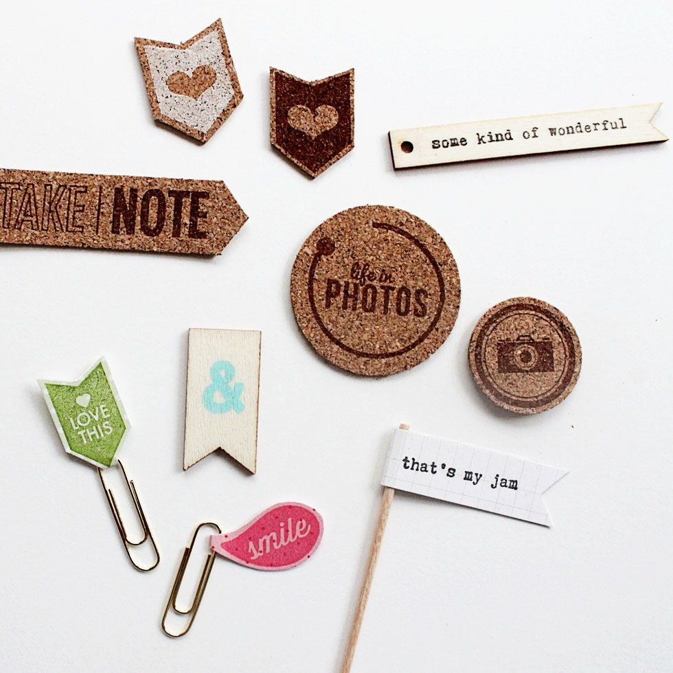
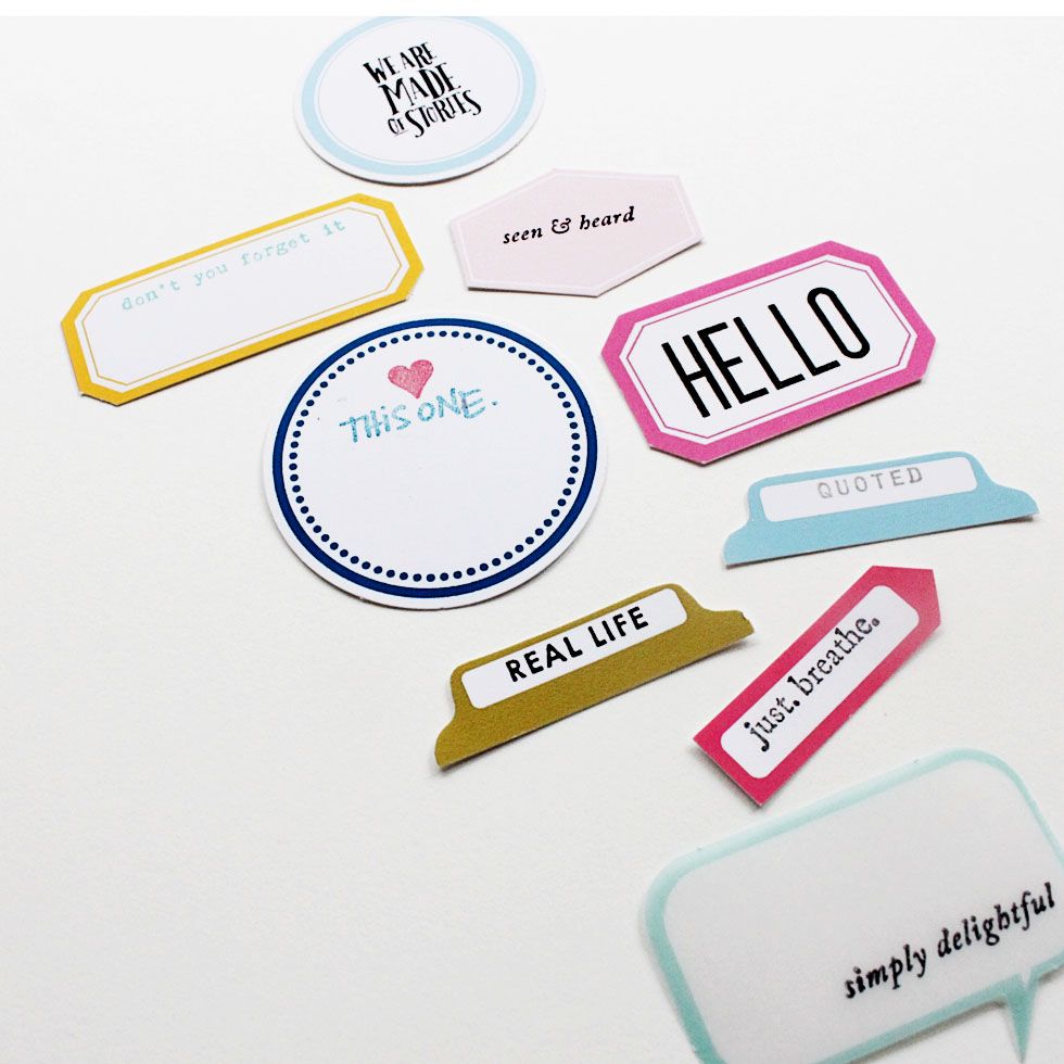
Favorite #1: diy embellishments
all stamps by Bananafishstudio except for "Life in photos" by Studio Calico and the ampersand which came in a Kelly Purkey alphabet set
"This one"is by Ali Edwards. "Hello" and "We are made of Stories" are by Studio Calico all others by Bananafishstudio
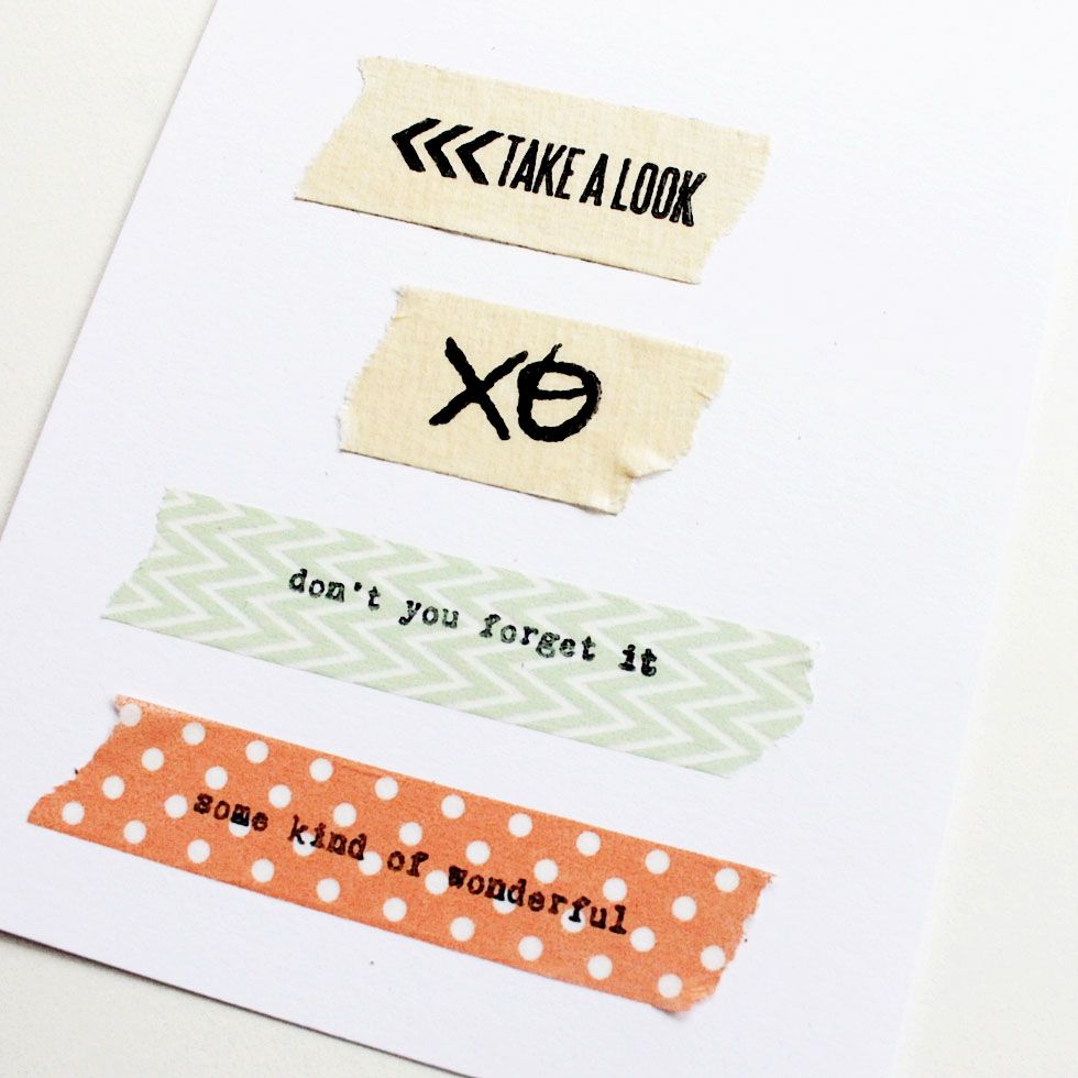
Making my own embellishments is super easy with stamps. I use tiny icons and expressions to pretty up all my little labels and tabs. I use them in conjunction with punches and die cuts. I make little flags and paper clip tabs. I stamp on washi, masking tape, cork and wood. You name it I do it. *simple tip...while using colored ink can create depth and visual interest, many of our projects have a ton of color already so sticking to simple black ink can really simplify the process. Also, be aware that you are using the right ink for the right surface. I use Staz-on for washi and vellum...but pigment/dye for everything else.
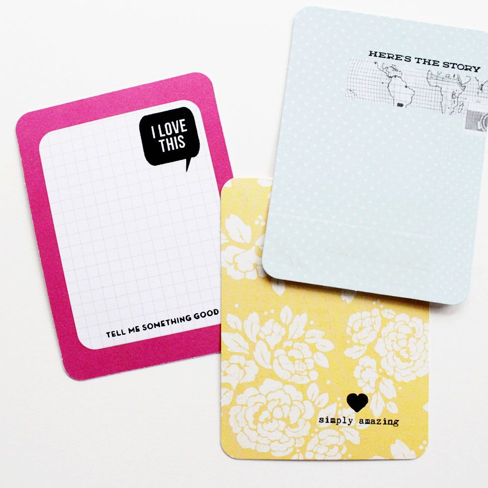
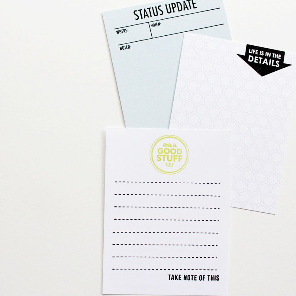
Favorite #2: journal cards
"Love this" bubble by Studio Calico. "Tell me Something" and "Here's the Story" are
both by Kelly Purkey
Stamps on bottom card by Kelly Purkey
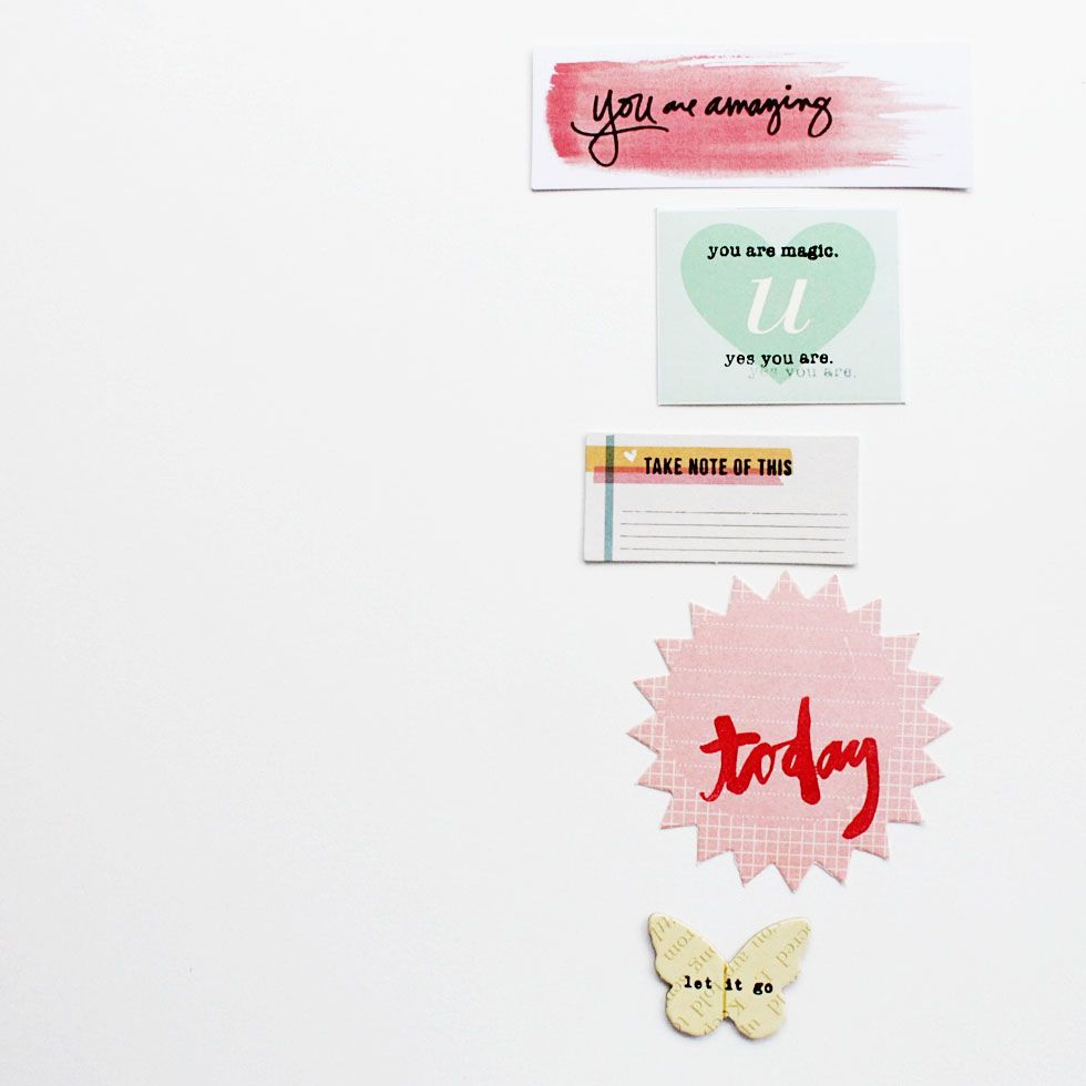
Favorite #3: dress up
"You are amazing" by Ali Edwards | die cut part of the Market Street collection. "U" die cut by Dear Lizzy | stamps by Studio Calico. Note tab die cut by Amy Tangerine | "take note" stamp by
Kelly Purkey. Diecut and "today" stamp by Studio Calico. Cannot remember source of chipboard butterfly. "let it go" stamp by Bananafishstudio.
I love words & icons...and I like to use them as a design element whenever I can. The fact is, a lot of product is geared toward kids or holidays or specific things that may not apply to my life. Don't like the sentiment on my wood veneer? That's okay, I flip it over and stamp something. This butterfly is adorbs on its own, but a small sentiment makes it feel customized. Super cute stickers and diecuts can sometimes feel a little bit awkward until you create some context. I also love breathing new life into old product with a well placed stamp. *simple tip...manufactured products come in an array of finishes so when in doubt use Staz-on. This is a great way to use those teeny tiny stamps that would get lost on a large background.
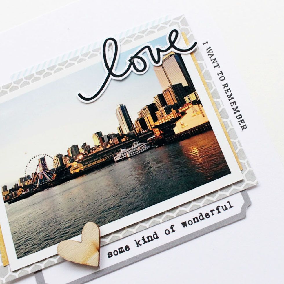
Favorite #4: accent
source of "remember" stamp unknown. "Some kind of Wonderful by Bananafishstudio
Sometimes simple for one person can be complicated to another. Don't care to make your own embellishments, prefer to use your computer for journal cards. don't want to mess up perfectly nice products with a smudge of ink. I get it...when I really can't be bothered to do any of the above, I just use my stamps as an accent on a layout, an art journal page or a journal card. I place it along the side of my photo, right beneath my title, in the top corner or the bottom. It doesn't really matter, because if I jack it up it can easily be covered. *simple tip...when stamping on layouts use a label, cut out a tiny banner or punch a circle. Sometimes stamping directly on the page can be super scary.
When it comes to simple stamping, "know thyself" is the key. Search for techniques that you know you can do and will do. Organize your supplies in a way that makes them available for use. Clean your stamps after you use them...I know a lot of people don't, but you will be a lot more inclined to use them if you know you don't have to spend a bunch of time cleaning them first. Limit yourself to a set or two, especially if you own a lot of stamps. Nobody wants to spend precious crafting time hunting for things. If you are using a lot of small stamps, cleaning and putting away each time can be a headache. I set all my little stamps down on a paper plate:) When I'm all done, I clean and put away. So simple and I love me some simple:)

1 comment:
Simple is awesome and these are the kind of ideas I love. I'm also impressed with the age of your collection. :)
Post a Comment